Portrait of a Summer Teacher

IMG_3719

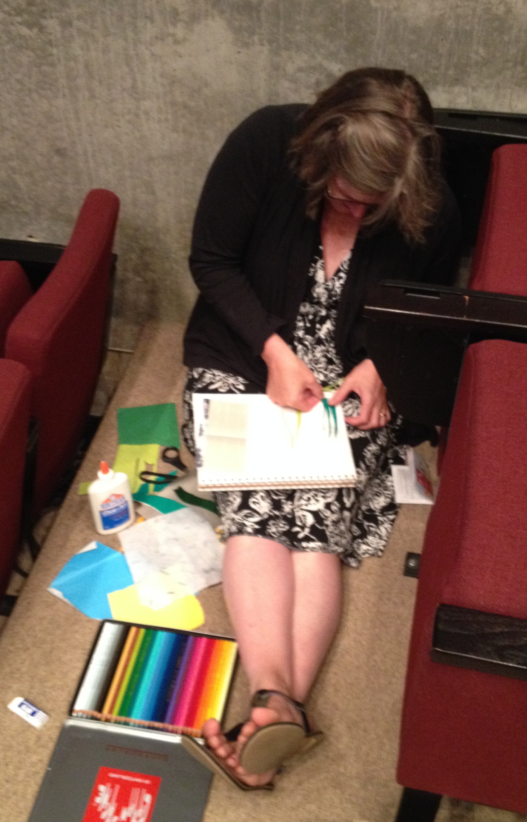
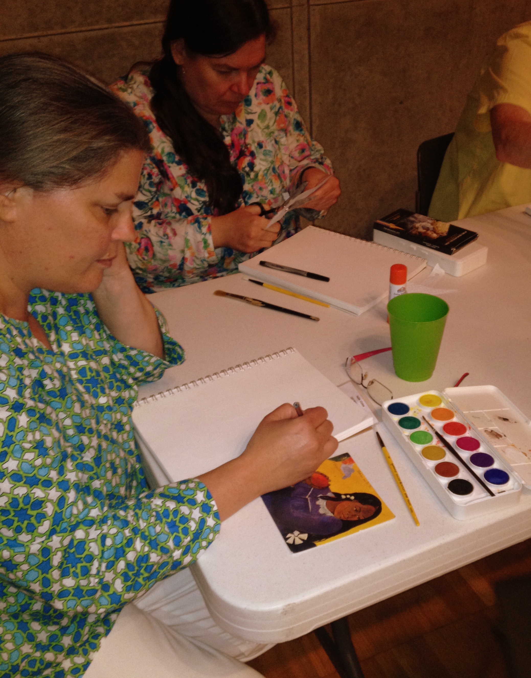
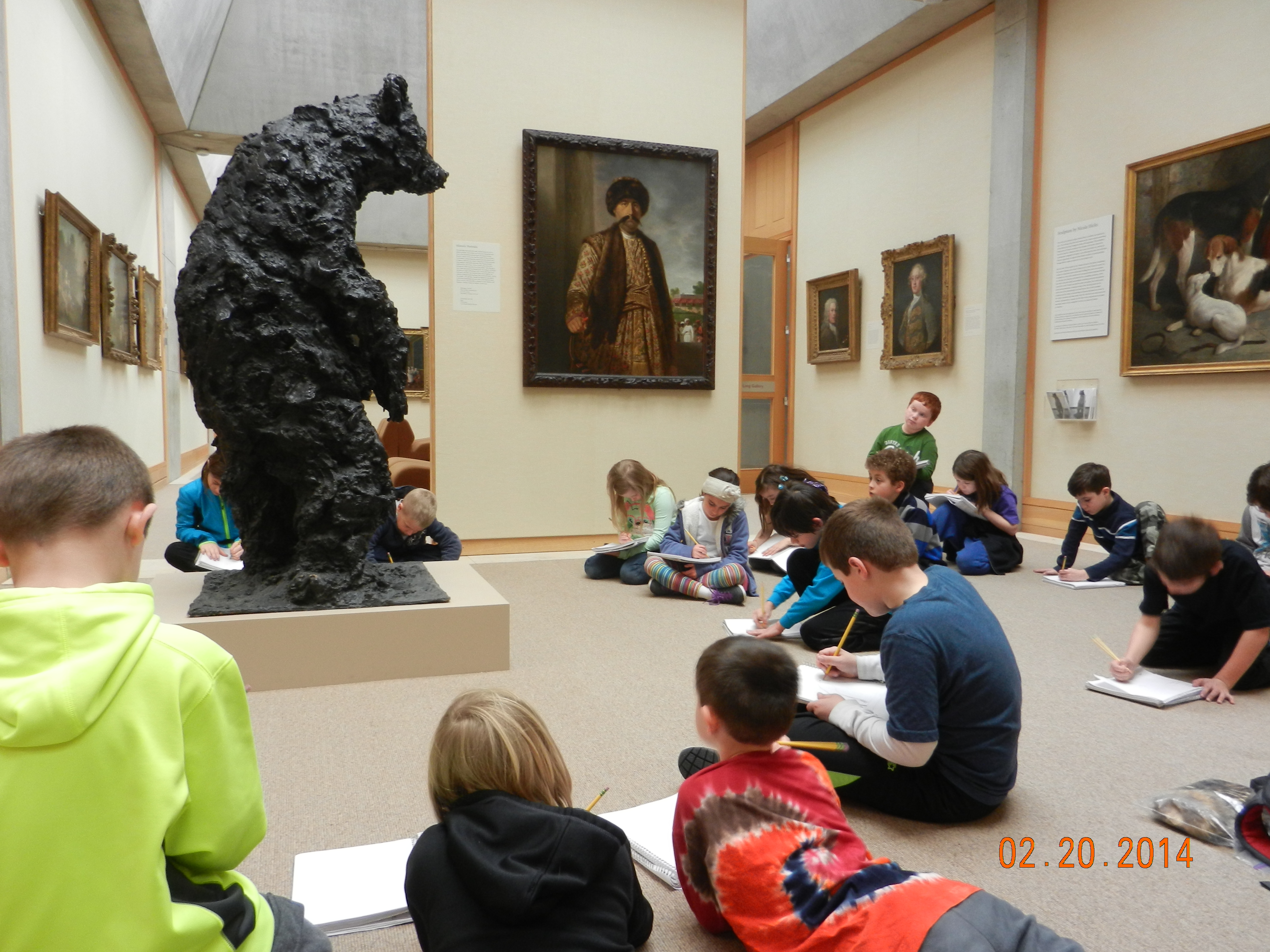
Just a couple of months ago, the auditorium at the Yale Center for British Art was speckled with torn paper, art cards, paintbrushes, cups of water, scissors, glue sticks, items to smell, feel, hear, and see. It was also speckled with teachers – teachers painting, tearing, gluing, drawing – and it was very quiet. The Summer Institute for Visual Literacy was under way. Out of the silence, from the floor between two rows of auditorium seats, comes a voice: “I’m sorry to break the silence, but I just have to say – I could not be happier!”


Carol worked on a collage inspired by the phrase in the text doorway: “Calm Morning.” She finds collage “liberating because it doesn’t require perfection.”

IMG_3734


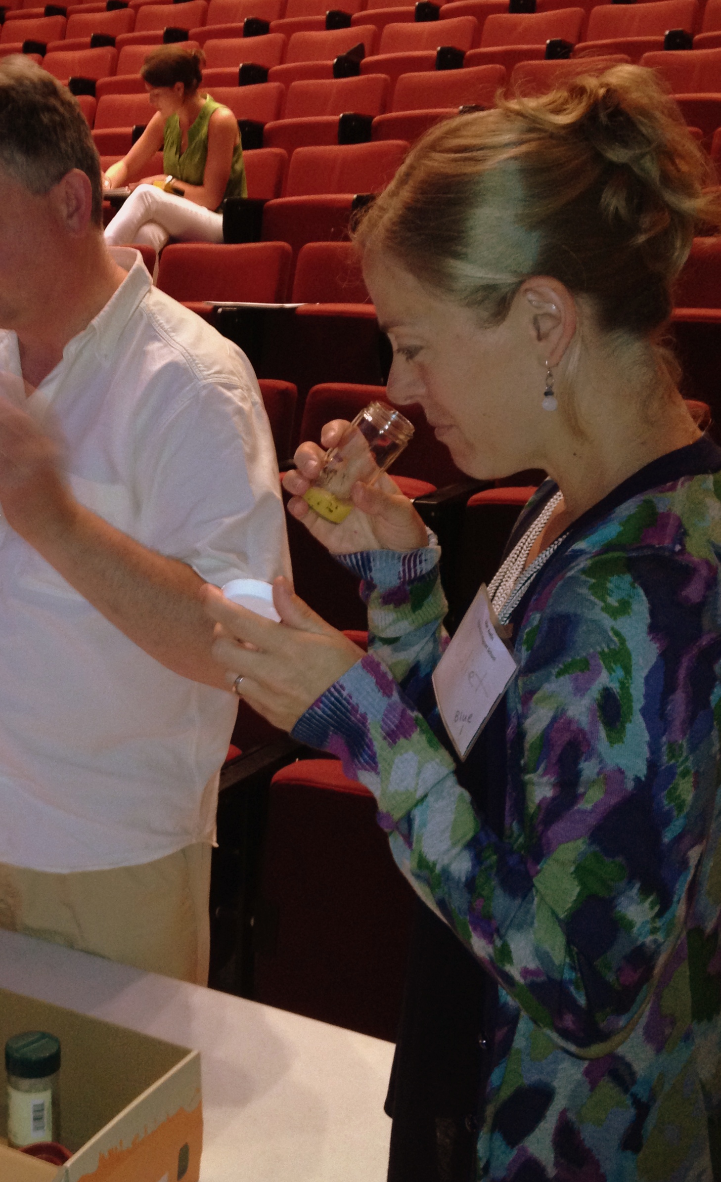
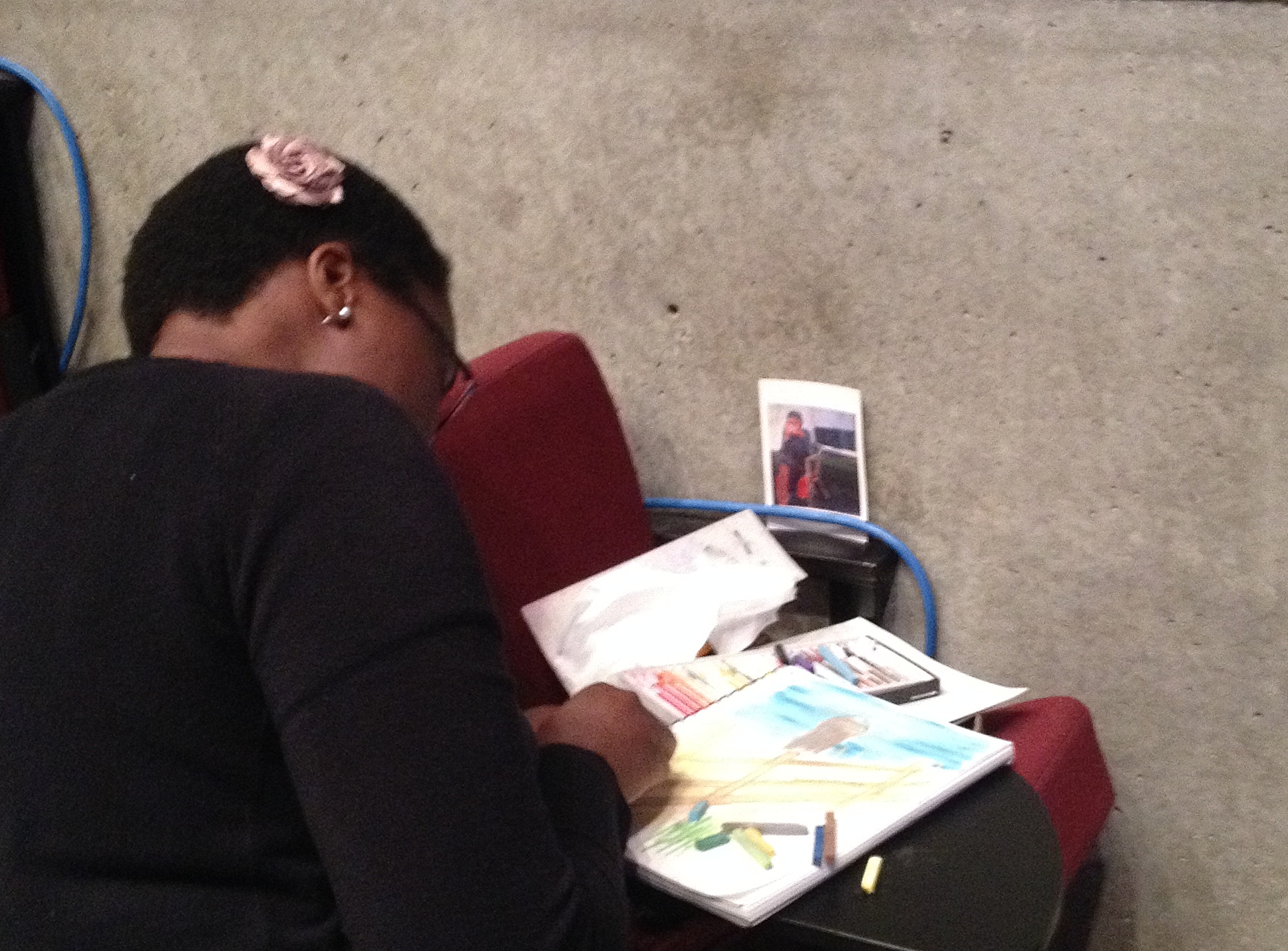
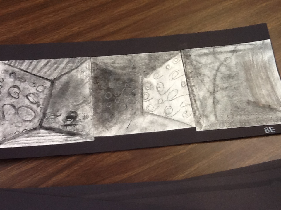
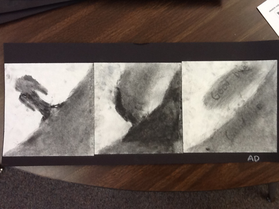
Sabine smelled lemon at the smell doorway, then found an art card to help her picture a place she’d visited. She used chalk to evoke a “blurry memory.”


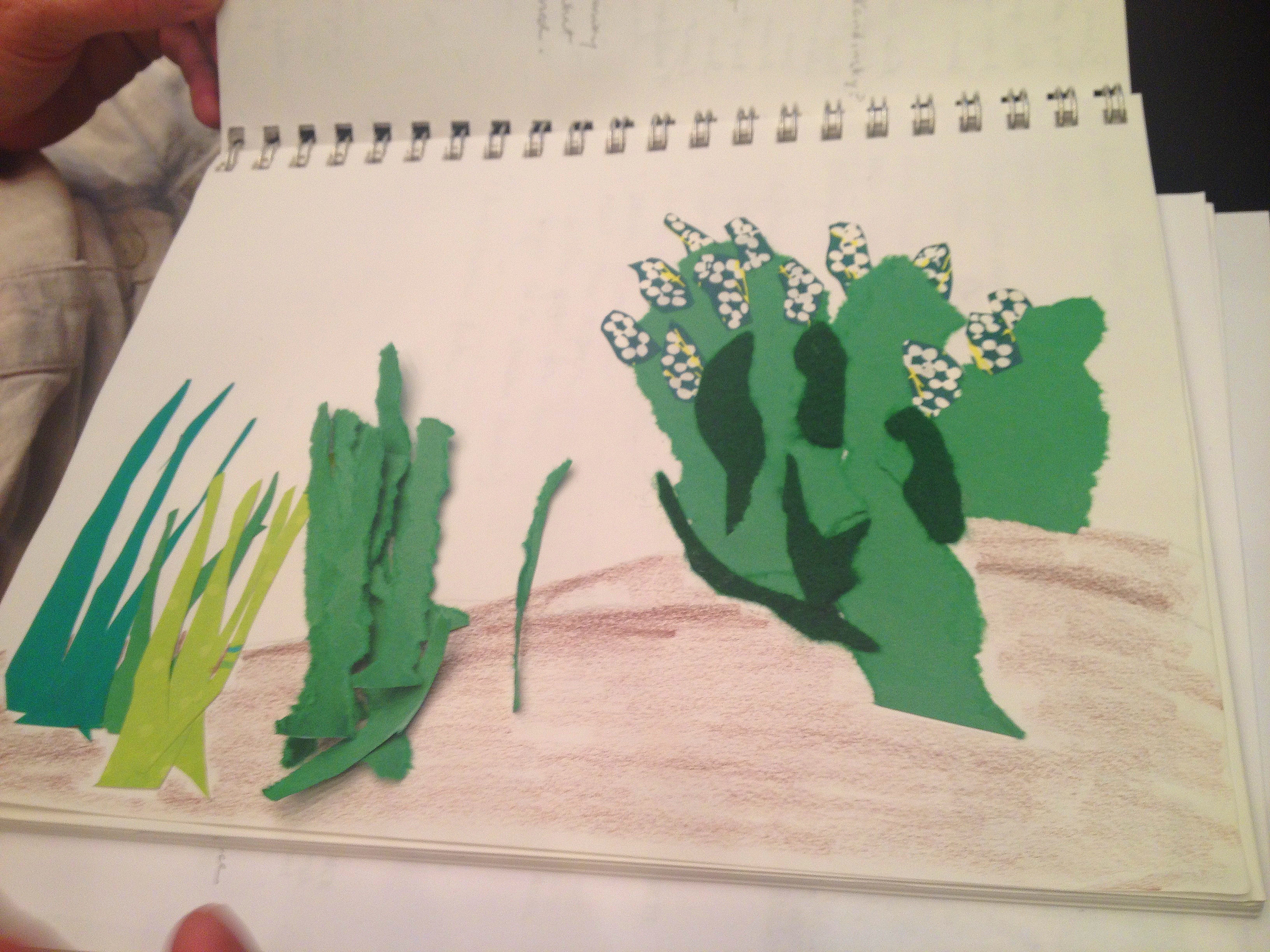
In the Doorways workshop, everyone found themselves in their own stories. Lindsay was back on a crowded train. Juliet was back in South India with the smell of coconut and Gaugin colors. Joe went back 30 years to share coffee with his brother in Texas. We left behind our fast-paced, distracting lives that week. We slowed down. We paid attention. We relaxed. And like a vacation, we knew it was going to be hard to take it with us.


As the first weeks of school are under way, I hope that teachers have found a way to harness this kind of deliberate, deep thinking and take it with them into the  year. Whether it’s altering everything you do just a little bit by bringing visuals into the classroom, or just keeping a journal for yourself for a while, the end result is better learning – and happier teachers.

First Drawing: planning, designing, reflecting

The circle undrawn is never the circle drawn; — Norman Nicholson

The 20th Century  British poet knew of the gap between our eye, our mind, and our hands. This gap, quite  apparent at the beginning of the school year awaits our response.  Integrating a visual strategy into your class can begin anywhere. The point is to start looking and start connecting looking to seeing, seeing to drawing, drawing to words.

For the past two years I have started with Albrecht Dürer’s Melencholia I (Albrecht Dürer – Melancholia I, 1514). I don’t spend a lot of time discussing the work of art as a cultural object; rather, we use the work of art as a beginning of seeing and thinking.  I have chosen the print for a variety of reasons. First, it is a significant work of art that continues to inspire conversation.  Many have tried their hand at its composition. The image also covers a range of objects and ideas: students can draw the entire piece or focus on one particular element.


“All her life Mary has been strong, confident and smart. Her parents were always wealthy, and had everything she had ever asked for. She had long beautiful silky dresses, and enough gold for the entire kingdom. Yet, she still felt as if something was missing – not something from her extravagant room, but something missing insider her…”


The image can handle sustained observation and the longer you look, the more you see.

“The Story: The woman, her child, and her crew were trying to get to their destination or the light in the distance. Their ship was wrecked and they were the only ones to survive. They washed up on a deserted island and the wreckage came with them. Now they are stuck on the gross uninhabited island and can see their destination in the distance. She is upset and starving. She is afraid she will die before someone finds them.”


The drawing work leads to conversation: What did you see? What did you draw? Why are these objects together? What does melencolia mean?  I then can ask the question (and one we will be asking and discussing all year): In what ways is seeing literal? In what ways is seeing metaphorical?

06-18-2014-12-22-51

“Two angels were sent to a small island. On the small island there were about 20 people on two boats which have crashed on the shore due to a bad storm. The boats no longer worked. Everyone was hot, thirsty, and hungry. They were so desperate for help…”


Of course, I don’t answer any of these questions, only start the story listening to the new worlds being made. The students are encouraged to speak, to say, and begin ‘showing’ what they see. And this starts our journey for the year. And our conversation…

–James Shivers


3 Picture Book Activities

-Patti Darragh


Noticing the connection between text and illustrations in picture books is a great way to generate writing and gather ideas for new writing pieces.

As with all visual literacy strategies, start with the art.

Notice how the text supports the art and how the art makes the reader understand the text more deeply. (Note the common core implication here!)


Green by Laura Vaccaro Seeger


pic book 1


Explores one color and names it in a variety of creative ways. Also shows how the shades of green are found in many things and relates objects to one another.

This book offers a creative way to build vocabulary and make associations between objects, themes and concepts. (OMG, more common core!)

Extend the idea; if you can do it with green-you can do it with any color!


pic book 5


Doodle by Rita Golden Gelman, Illustrated by Paul O. Zelinsky

I love using this book with students. The idea is to follow a stream of consciousness in gathering ideas for a story. It is also a great example of alliteration.

I have students use a long strip of folded paper and black felt tip pens. They can add color later if they like. But the felt tips have a way of gliding over the paper that encourages the flow of ideas. (Can you believe it? Sequencing…Common Core AGAIN!)


The idea is to focus on line and connect ideas to each folded page. This student used alliteration and line. I love the second fold that highlights spinning actions and the third showing sound in “tappers tapping”.


pic book 4


Any book by Chris VanAllsberg

Examine his illustrations (especially the black and white) to talk about line, shading and texture and how they all contribute to tone. (Need I say, CCSS?)

One activity is to create a 3-4 panel sequence using charcoal and one or more of the following: white, gray, or black: colored pencils, crayon, oil pastels

Have the students experiment with the mediums before creating their own pictorial stories on the panels. Each time I do this, I learn something new from the kids that they discovered during exploration. Sharing their ideas and discoveries builds community and brings excitement to the process.

Sequence in charcoal:


pic book 3            pic book 2


Sketching and Writing

builders sketch cropped


Sketching time is the planning piece of writers’ workshop. There is no talking. I prefer it to be silent, but many people (students and adults) enjoy soft music in the background. The idea is to have an environment where you can concentrate on the drawing and listen to your thoughts as you sketch.


When it is quiet, it is easier to do, especially in schools where there is so much activity right outside the classroom door and students are in close proximity to each other. But, as you might have noticed in the movie trailer, when the children sketch, they are totally engaged; observing, making marks and thinking.

The galleries in the museum are ideal places to sketch. The atmosphere in the museum encourages thought and quiet reflection despite the fact that the museum is a public place with visitors constantly walking by.

Some people mentioned yesterday, they got lost in their thoughts as they sketched and didn’t hear any of the sounds around them in the galleries.


DSCN1323


Your students will feel the same when you bring them to visit.


I am always amazed at the memories and ideas that come to the surface when I am in the process of sketching.

Ask yourself. When you sketched in the galleries, were you reminded of someone or an event you hadn’t thought of in some time? Or did an idea occur to you that you hadn’t planned on?

I noticed with the group that when it was time to stop sketching and begin writing, there was no hesitation. Everyone had something to say and put pencil to paper immediately. No “writer’s block” seemed present.


How did that feel?

How did sketching help you begin writing?

Did you feel less pressure to produce writing?

How did you feel having invitations versus and assignment to writing?

How would your students react to this process?


Sketches serve several purposes in the classroom. With younger students, I post a sketching rubric as a reminder of expectations and to eliminate the requests for new paper and do-overs. I want them to work out the changes on the original piece. Don’t discard ideas, just put them aside. The sketch is not meant to “go with” the writing, it is more a collection agency of ideas and details that will be used for reference as they write.


I encourage students to keep their sketches on hand as they write. When they get stuck in writing the first thing I say is, “Go back to the sketch, add something, change something. “ This is the beginning of revision, even if they add shading or introduce a new color or object to the sketch. It will bring them back to the writing.

As I conference with students, the sketch is the first thing I read. Then, as I read the writing, I can refer back to the sketch to ask questions. It is a great way to get students to add elaboration to their writing. Sketches hold the details; expressions on characters’ faces, setting, tone, details on objects (color, shape, line). Are these details reflected in the writing?

Close looking at student sketches offer the teacher opportunities to ask questions and have deeper conversations with students about their writing. It is a more concrete way to start a conference conversation than “Tell me about your writing”.


Have fun with this-Patti


Using Your Senses


By Jennifer Kowitt


Yesterday at the Summer Teacher Institute, we discussed multi-sensory engagement in the galleries.  Providing students with opportunities for connecting with a work of art through more than just sight can prolong engagement, differentiate instruction, and enhance meaning making.  Take a look at the painting below. What could you bring into the galleries to create multi-sensory experiences with this painting? What would you ask your students to do or think about?


reynolds


Joshua Reynolds, Elizabeth Gunning, Duchess of Hamilton and Argyll (c. 1760). Oil on canvas. Yale Center for British Art, Paul Mellon Collection.

First Day Reflections


image


Today was the first day of the YCBA Summer Institute for teachers. As in any classroom on the first day, we began tentatively, looking for familiar faces and settling into listening mode when Tom and Cyra got us started. As we broke into groups, and got into the deeper thinking that happens when we talk about art, we inevitably began to know each other as teachers, learners, thinkers, observers. And in the afternoon when we drew and made our own art, we started a community which will be ours for the week.


I am always struck by the trust and comfort that emerges when art is at the center of a group of people. My son likes to go to jazz clubs in New York because he says no matter who everyone is outside of that club, they are all friends while the music is playing: the common language of jazz brings them together and  forms their community. When I watch a group of students gather around a painting or sculpture – even a reproduction – there is a similar intimacy that comes over them. They may all have their differing opinions and translations of the art, but they are brought together by one image.


As we continue this week, I wonder if any of you have thoughts about how to use art to create your classroom community. How could art start your year in September? How can you include visuals to ground your students in safety, so they can think deeply and share courageously? What can you bring into the room? How will you show them how to do it?


The Surface

buckingham 4


Today we talked about staying on the surface, about noticing all that we can of what’s right in front of us.


Texture.


buckingham 6


Gesture.


buckingham 2


Composition.


buckingham 1


Detail.


buckingham 3


Story.


What did you notice?


A Beautiful Museum

museum


” It was a beautiful museum. It was a beautiful big museum. I loved that museum.”

That’s how I felt  welcoming the participants of this year’s summer teacher institute to the galleries today. We began in the Entrance Court and I was sitting with this view of Barbara Hepworth’s Biolith.


biolith3


Here’s what I wrote in my sketch journal:

How many people has she greeted? What thoughts has she shared? How long does it take for her quiet scratches, glances, shadows to show themselves?


What were you thinking about today? Did the building, the collection, the conversation speak to you in some way? Let us know!


Translating Oil to Paper


clausen

George Clausen, Schoolgirls (1880). Oil on canvas.

by Jennifer Kowitt

As part of today’s drawing activity, our group recreated George Clausen’s Schoolgirls using only construction paper.  Through drawing a work of art, students look more closely at the detail and evaluate the way in which the work was constructed by the artist. We think of drawing as putting pen/pencil/etc to paper, but this activity encourages you to think about drawing in a different way. The goal of this activity is to provide students with the benefits of close-looking that come from drawing a work of art, but to allow them to do so using another medium.  However, as the final product made only of  construction paper can never look exactly like the real painting, there is no pressure for students to make theirs look “just right.”  And because this activity doesn’t use glue or scissors, you can do it in the museum galleries!

The only materials you will need for this activity are: (1) construction paper in each of the colors used in the painting, and (2) large sheet of construction paper as work space.

Directions:

1. Assign students to work in pairs.

2. Tell students that their job is to recreate the painting before them using ripped pieces of construction paper.

3. Students can rip and manipulate the paper in any way that they would like.

4. They should build their picture on the large piece of paper provided as a work space, but that work space should not define the size of their composition (i.e. they do not need to fill the whole work space with the ripped paper).

5. After students have finished, let them look at the work by the other pairs in the class.

6. When you are done discussing, you can fold up the work space and recycle the whole thing. No mess!


Our post-activity conversation included discussions about scale, perspective, layering, shapes (both in the painting and how to create them), problem-solving, visual priorities/main idea in the painting, the relationship between nature and urban, and how to represent without line.

Please post your photographs of your collage of Schoolgirls! (p.s. this counts as your homework assignment for the night!)

Seeing Blue

Recently I spent time looking through the archives.*  I was curious about the writer Henry Peacham – his work on rhetoric has had a large influence and in searching the collection, I discovered he also wrote on drawing and painting. In The Gentleman’s Exercise (1694) he covers a range of topics from exercise to illness, from drawing to recipes for creating color for painting.


IMG_0509 - Version 2


Reading his descriptions on how to mix materials to create array of colors I came to a simple realization: when we look at a painting we are often looking at the unique mixing of a particular color. The museum then is not only a place of visual meaning, but also a site of visual making by particular human agents located in a specific time and place. Color here is linked to a person and a composition, not a digital formula. A museum hums conversations of color. In the age of screens (even with retina), paintings –as acts of color making –are translated in a plane of sameness. Machine color is amazing. Human color authentic, located, aging, limited.


IMG_0511 - Version 2


When you have a chance, go to the museum. More than ever, we need to see the physical design of color. Composition and color are structural markers similar to narrative devices. What colors are used for somber, gleeful, mysterious, industrial moments?


IMG_0518 - Version 2


Color is not singular, but plural. When we say ‘blue’ we have a host of blues. Seeing these blues in a museum expands our visual terrain. A place where the constant play of context, space, light, and size of the canvas affects our seeing.  A direct physicality emerges beyond the reach of mediated machines, like this one.  The museum space fuses with our perception, our day and our space. We don’t just see once.


IMG_0504 - Version 2


We can see blue on our screens. Yet, do we ever think of making blue? With making comes choice, volition, effort, trial and error, quality of material products: the variables increase, and now as we look we can see that artists have a certain color design, a certain way of using the canvas, the brush, the elements. We realize that a color like blue is also a multifoliate human narrative.


IMG_0508 - Version 2

*See Rare Books and Manuscripts and the Reference Library and Archives for more information.

All photos were taken on April 16th, 2014 on the fourth floor.  For a wonderful history of the color blue, see Blue: The History of a Color by Michel Pastoureau (2001).

–James Shivers