I really enjoy playing with data, exploring new knowledge behind them, and visualizing complex data sets. Here I show a few examples from some fun side projects about soccer and my previous studies of flow motions. =)
1. Statistics of soccer: the best team in the world
Leo Messi, Christiano Ronaldo, David Beckham, Zinedine Zidane, Manchester United, Barcelona FC, English Premium League, Spanish League La Liga… As soccer fans, we always have our favorate players, team, and league. Sometimes, we have feelings a few teams play much better than others during a certain period of time, some teams could score more goals, and some games are more exciting than others. But objectively, which team is the best? What is the probability of win? How are goals distributed? Can we visualize the evolution how and when a team becomes a superpower? Few weeks, with these questions in mind, I started to look at soccer data of in total 41,142 games across five leagues in Europe from 1994 to 2016.
As a fan of Manchester United, I regret to say that Barcelona FC turns out to be the best team in the world for the past 10 years. The performance of my team, Manchester United, declines dramatically in recent 4 years. I will analyze the data Manchester United in details later. But now, let’s first look at Barcelona FC Fig. 1
This plot shows the time series of the goals scored or against by Barcelona. Each data point is a one-year average. The team always performs better than the average of the league. It scores more and loses fewer goals per game. It did pretty good job in the past 23 years. And apparently, the team performs better and better in recent 10 years. It puts more goals in the opponent’s nets and carries less in its own pocket.

Fig. 2
When exactly did Barcelona become a superpower? This transition can be identified more clearly in this time-evolution plot. It is plotted as goal scored v.s. goal against. Each point represents the average of data for one year. The results of the whole league are shown as references as red, green, and blue dots, for all games, home games, and away games, respectively. Barcelona always performs better than the averaged performance of the whole league. And in 2008, it suddenly jumps to a much higher level, with more scored goals and less lost goals. The performance is clearly separated from its previous patterns. A new era begins…

Fig. 3
If we compare the performance of Barcelona with other teams in the Spanish league (the plot of ratio of goal scored and against, on the left), clearly, the team represents the upper bound of the league for the most of the time. Especially after 2008, its performance leads ahead of any other teams with significant margins. Even compared with all teams in five leagues in Europe (the plot on the right), it consistently ranks as one of the top teams, and as the best team within past 10 years.
The reason of this sudden transition from an already strong team to a superpower at 2008 deserves further exploration. Here, I only briefly list a few things happened around that time. 1. In 2008, Pep Guardiola was assigned as the new coach/manager of the team, who first introduced to the world the Tiki-taka which is a style of play in soccer characterized by short passing and movement, and maintaining ball possession. 2. In 2008, Leo Messi became one of the starting eleven players. Although Messi has risen to Barcelona’s first team since 2004, he was in the shadow of other super stars such as Ronaldinho. Messi was given the number 10 shirt in 2008 after the dismissal of Ronaldinho, and started becoming the super star of the team. 3. Spanish National Team won the World Cup 2008, and UEFA Euro Cup 2006 and 2010. More than half of the players in Barcelona played for the National Team as well. I agree that attributing a success of a team to one or two individuals or events is biased. But it is interesting to see these links. And more interestingly, such links are also observed in other soccer teams, such as Manchester United, Chelsea, Paris Saint-Germain and more (I will briefly mention that later).

Fig. 4
The map of goal distribution shows how many goals Barcelona scored and lost. The color indicates the probability that different events happen. The size of bubbles also represents such probability (but probability here is shown in log-scale to make small probability also visible).
Within all games from 1994 to 2016 (the plot on the left), Barcelona has put 8 goals in the opponent’s nets multiple times. But sometimes, it had to come back home with at most 6 goals in its own pocket (it lost a game with score 3-6). Most frequently (~9%), Barcelona ends the game with 1-0 win or 1-1 draw. For all games, it has 63% probability to win, 20% probability to draw, and 17% probability to lose.
Within the past 10 years (the plot on the right), the distribution pattern evolves. While keeping scoring goals, Barcelona loses much less goals. Its favorite scores are now 2-0 and 2-1. The overall probability of win increases by 9% compared to the 23-year average.

Fig. 5
Such performance in past 10 years is great. But it seems the team is not satisfied with it yet. Barcelona keeps moving its exceptional performance forward. Within the past 5 years (the plot on the left), it guarantees 77% win and has its favorite scores 2-1, 2-0, and 4-0. If we only consider the home games where Barcelona hosts the game in its home, Camp Nou, we see an incredible 87% probability of win and only 6% loss. At Camp Nou, its favorite scores are now 4-0, 2-1, and 5-0, with probability larger than 10%, 10%, and 8% respectively! Sorry for those guest teams who visit Camp Nou, mostly they would lose the game, with a very large margin.
And yes, if you have a chance to visit a soccer stadium anywhere in the world and want to see a goal just for fun no matter who wins, just go to Barcelona’s home Camp Nou. You will have 99% opportunity to see at least one goal!

Fig. 6
For various reasons, I would really like to know the probability of win when Barcelona plays against other teams. The polar plots show the probability for the home games in the past 5 years. Each point represents an opponent team. Only 3 teams out of 24 has the probability less than 60% not to lose to Barcelona. And when playing against 16 teams, Barcelona keeps winning them every time at Camp Nou.

Fig. 7
The remarkable performance in its home field Camp Nou also ranks No. 1 across whole Europe. This polar plot shows the probability of home-game win for all teams in Europe.
2. Statistics of soccer: league performance

Fig. 8
Averaged goals scored per game, all teams in 5 leagues. By comparing 23 years average and 5 years average, it shows the number of goals scored per game does not change significantly. Although it seems the game does not evolve from the goals scored per game, dramatic change actually happens as shown below.

Fig. 9
These two polar plots shows the probability of win for all teams. Each point represent the probability of win for each team. The 23-years statistics shows that most of teams have less than 50% chance to win the game. A few strong teams can be identified with higher chance to win, but their chances do not lead ahead much. However, recent years e.g. over past 5 years (shown in the right plot), several super teams emerge which have winning probability close to 80% and lead other teams by a big margin.

Fig. 10
An interesting pattern emerges in the French league Ligue 1. If I average the goals scored every half-month, the resulting time series display significant correlations, with 1-month period. It means if the league scored many goals in the first half of this month, we know it would provide fewer goals in the first half of the next month, where maximum correlation is -0.4. But in terms of the second half of this month, we don’t know really know, since the correlation is close to 0. Then this pattern repeats through out the whole season.
3. Interesting links between a team’s performance and some individual events
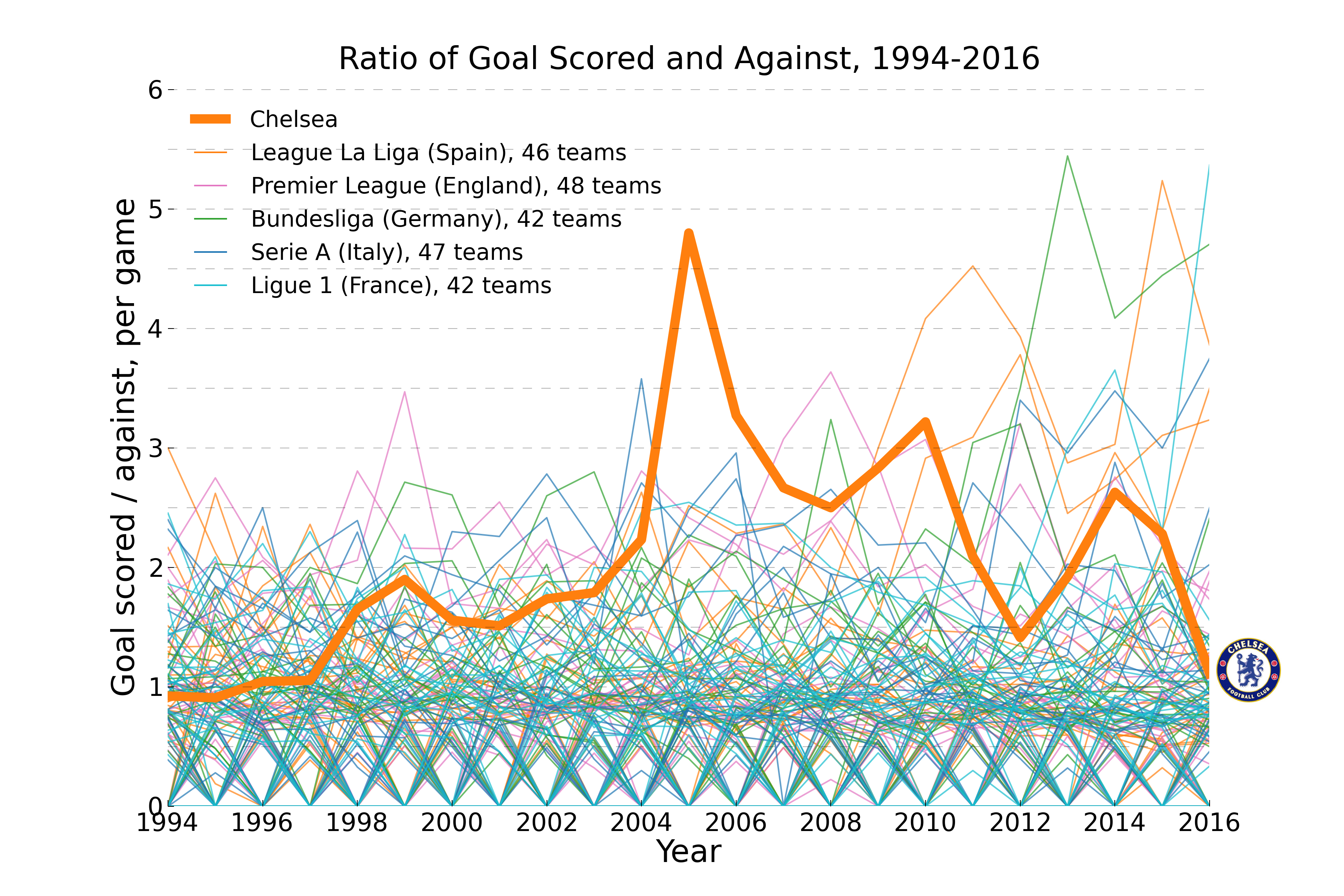
Fig. 11
Since 2003, Russian billionaire Roman Abramovich brought Chelsea Soccer Clue and invested a lot to invite top players and manager. Within next two years, the team becomes one of the superpowers in Europe.

Fig. 12
Qatar Sports Investments (QSI) became the club’s sole shareholder in 2012. The takeover made Paris Saint-Germain the richest club in France and amongst the richest in the world. QSI invested a lot on the team management, and invited one of the best striker in the world Zlatan Ibrahimović to join the club in 2012. Since then, the club won all the champion titles in the French league, with soaring performance.

Fig. 13
Christiano Ronaldo was in the team 2004-2009, during which the team achieves its best performance. Middle field player and brain of the team Paul Scholes didn’t play many games after 2012 due to injuries, and officially retired in 2013. Alex Ferguson retired from his position as coach/manager. In the data, team performance declines dramatically since 2012.
4. Flow Visualization


