This exercise will take you through collecting, interpreting and visualizing Singaporean educational data in order to answer the following questions:
- How does Singapore create a national narrative through the data it publicly shares? What data is missing, and how might this complicate a single narrative?
- What are educational attainments of Singaporeans over 15 by ethnicity and language?
Please work with a partner and record your answers in a word document with your names clearly labeled at the top. I won’t be grading the assignment, but will be asking you to share your data visualizations by the end of class.
To complete the data exercise, please answer the questions listed below in bold.
Part I: Overview of publicly available Singaporean educational data
Please look at the following websites that give Singaporean general and educational data and examine the data visualizations available there. Consider with your partner:
- What does the data shared tell us about Singaporean priorities or concerns? How does the publicly reported data support Singapore’s national narrative?
- What data is not being measured or publicly shared?
- How might this complicate a single narrative?
- https://www.singstat.gov.sg/find-data/search-by-theme/population/education-language-spoken-and-literacy/visualising-data (check out the Singapore Population and Census 2020 and Census 2020 Education)
Part II: Working with data: Downloading and interpreting data tables
In this part of the exercise, we’re going to create tables and download them from Singapore’s Department of Statistics in order to answer the following questions:
- What Singaporean ethnic group (and language group) have the highest rate of educational achievement, as of 2010 data?
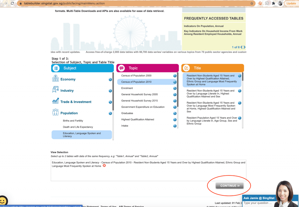
- Go to https://www.tablebuilder.singstat.gov.sg/publicfacing/mainMenu.action
- Select Population
- Then Select Education, Languages Spoken and Literacy
- Select Census of Population 2010
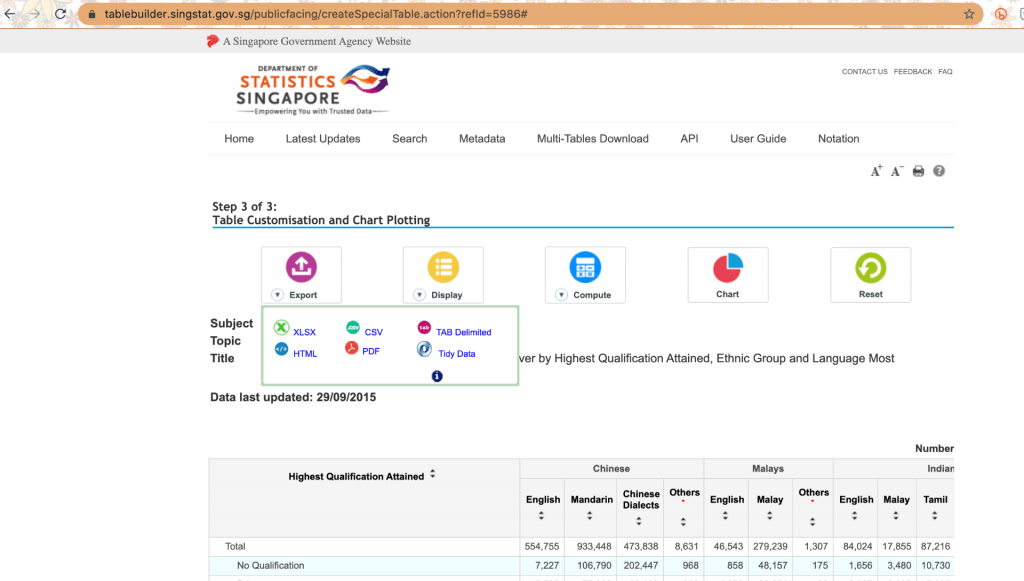
- Select Resident Non-Students Aged 15 Years and Over by Highest Qualification Attained, Ethnic Group and Language Most Frequently Spoken at Home
- Select the “Continue” button.
8. (In 2021, for collaborating purposes, let’s work in pairs off a collaborative google sheet document, using the data from this link.) If you don’t have Microsoft Excel on your computer, you can access the data as a googlesheet. http://bit.ly/383LFKQ Please make a copy for yourself that you can modify.
9. As you and your partner look over the data, what do you notice?
10. It may be hard to determine patterns since the population sizes vary considerably from Chinese, Malay and Indian. It’s better therefore to convert to percentages.
11. To create percentages, create two columns after each grouping: Chinese, Malay, Indian, other.
12. Label these new columns “Total Chinese” “% Chinese”, following the same format for the other 3 groups.
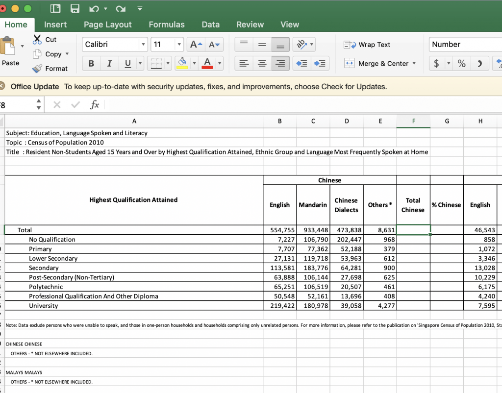
12. Calculate Total Chinese Singaporeans aged 15 and older by adding in the formula =sum(B3:E3) to column F, total Chinese.
13. Repeat the equation through the whole column by pulling the bottom right green square down the entire column.
14. To calculate percentages of total Chinese in column G, enter in the formula in column G: =F8/1970672 (the total number of Chinese Singaporeans over age 15 in 2010). You will need to select the percentage button in the top ribbon to show percentages.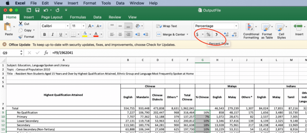
14. Pull down on the green square in the bottom right of square G8 to duplicate the formula throughout the entire column. (This is my favorite excel tool!)
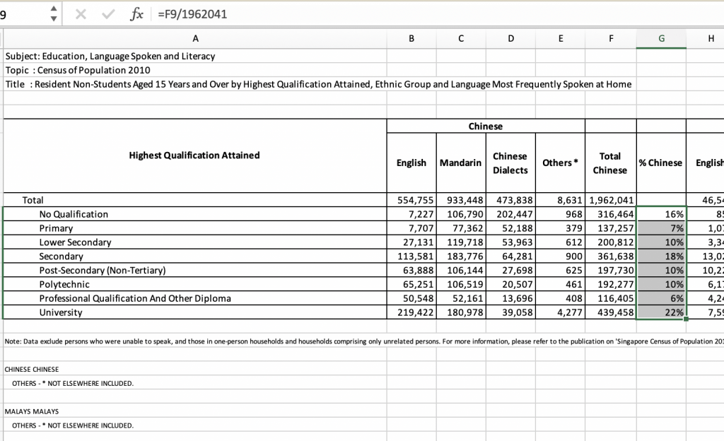

15. Interpreting data: What do you notice about where educational attainment of ethnic Chinese Singaporeans is clustered? How does this differ by those who speak English as their primary language, vs. those who speak Mandarin and those who speak dialect?
16. Repeat this process of calculating totals and percentages for Malay, Indian and other.
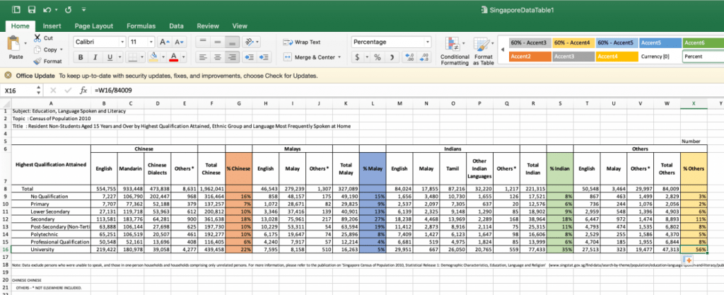
17. Your data chart should look something like this:
18. What do you notice about the educational attainment of ethnic Malay and Indians? How does this compare by home language? What patterns are you interpreting?
19. With your partner, choose several key pieces of data that you want to highlight to demonstrate educational disparities in Singapore using your percentage data. This could be a bar chart or a pie chart. The key thing is YOU CHOOSE WHAT YOU WANT TO VISUALIZE.
- for eg. do you want to focus on differences between languages within an ethnicity?
- or completion rates for a particular level of schooling across ethnic groups?
20. To do this, create a new sheet on your excel document or google sheet, and copy ALL the data from the first page to it. Make sure to select PASTE SPECIAL and then select VALUES, otherwise you will end up with the formulas from the previous page copied over and a lot of error messages.
21. Delete out the data you don’t want until you end up with the variables you want to save.
22. I’m going to create a data table to make a visualization of the total number of Singaporeans by ethnicity, compared with the % by ethnicity in university. To do this, I’ll need to calculate percentages of each group by the total number of Singaporean adults and the total number of Singaporean university graduates.
My simplified data table looks like this:

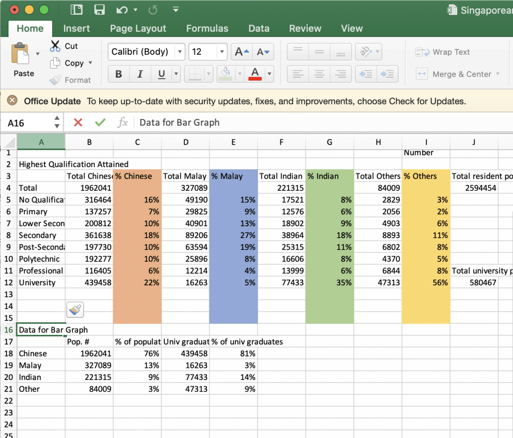
Use Insert Charts on Excel or Google Sheets to make a visualization. Make sure that there is a clear heading that states what the data is of, and that your sections are clearly labelled.


What kind of chart did you create?
Congratulations! You have now downloaded government data, created data tables and made a data visualization that you might include in a research paper. You can do summary statistics! Congratulations!
If you have extra time:
- look for data for your country study project
- If you’re working with a partner on Assignment 2, use the extra time to meet with your partner.
